University signature, logo, and Jayhawk
The university marks’ primary purpose is identification, but they can also grant legitimacy and even evoke emotion.
The university’s official marks are the KU signature, the KU logo, and the current Jayhawk. No other marks, including unit signatures, may be created by any unit of the University of Kansas other than KU Marketing.
To ensure quality and consistency, mark usage is strictly managed by KU Marketing and KU Athletics’ licensing directors.
Choosing the right mark

University signature

Logo

Where should a mark be used?
An official mark should appear on all external university communications, including the front or back cover of all folded print materials. In most cases, a mark is meant only to identify, not to serve as a primary design element. Make marks only as large as necessary for legibility, and establish a clear visual hierarchy in placement and proportion.

How to show affiliation with KU

Marketing materials

Giveaways to the public and students
University signature
The Trajan font was customized for the logo and logotype, so no part of the KU signature should be reset or used independently. The university signature is the preferred mark for more formal situations and with audiences who may be unfamiliar with the university. It is available in vertical and horizontal orientations. Use the orientation that best fits the space you’re working with.

Clear space
Clear space is the specified area of empty space surrounding official KU marks. No words, graphic elements, or other marks should be used in this space. Clear-space requirements must be observed in all circumstances.
The clear space is relative to the size of the signature and should be one-half the height of the KU logo (x) on all sides.
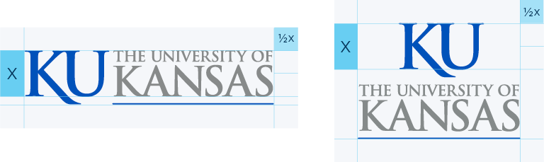
Minimum size
The height of x should not be less than three-eighths inch in print or 55 pixels in interactive uses.

Two color
The two-color signature is always preferred. It should be used on a white or light background. Don’t use the signature on a background that provides insufficient contrast.

One color
If used in one color, the signature should be printed in only black, KU blue (PMS 293), or KU gray (PMS 430).

White
When using a solid-color background, the signature colors should be reversed (white).
Logo
The logo’s extended leg on the “K” — an alteration of the Trajan font — represents the Hill of KU's Lawrence campus. This mark resonates with an audience who is already familiar with the university. The KU logo is the preferred mark when space is limited or the the signature is too complex for production, such as small embroidery.
The KU logo is a federally registered trademark, and the ® must always accompany the logo when used by itself.

Clear space
Clear space is the specified area of empty space surrounding official KU marks. No words, graphic elements, or other marks should be used in this space. Clear-space requirements must be observed in all circumstances.
The clear space is relative to the size of the logo and should be one-half the height (x) on all sides.
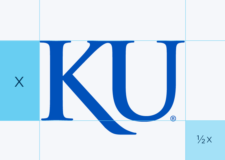
Minimum size
The height of x should not be less than one-quarter inch in print or 55 pixels in interactive uses.
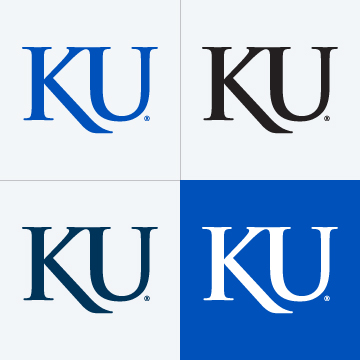
One-color logo
The KU logo should appear only in KU blue (PMS 293), Night (PMS 655), black, or white.

Outlined logo
A crimson (PMS 186) KU logo outlined in white is permissible only on a KU blue (PMS 293) background to show contrast — and only with approval from the director of Trademark Licensing.
Jayhawk
The Jayhawk often represents the university in place of or in addition to the KU logo and signature.
It can face either right or left. It is a federally registered trademark and must always be accompanied by a ®.

Clear space
Clear space is the specified area of empty space surrounding official KU marks. No words, graphic elements, or other marks should be used in this space. Clear-space requirements must be observed in all circumstances.
The clear space is relative to the size of the Jayhawk and should be one-sixth the height (x) on all sides.
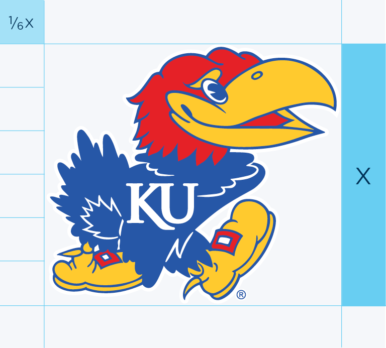
Minimum size
The height of x should not be less than one-quarter inch in print or 55 pixels in interactive uses.

Three-color Jayhawk
The three-color Jayhawk is always preferred.
- If it’s placed against a dark background, use the version of the Jayhawk with a white outline.
- In print, when possible, use the CMYK and KU blue (PMS 293) version.
- When screen printing, use PMS colors KU blue (PMS 293), crimson (PMS 186), and yellow (PMS 116).
- When the Jayhawk will only be viewed on a screen, choose the RGB version.
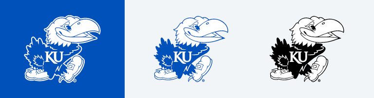
One-color Jayhawk
The Jayhawk may also be printed in one-color black or KU blue (PMS 293). When used on a dark background, the Jayhawk should have a white outline to provide contrast. In any one-color application, the body should always be dark.

Reversed Jayhawk
In cases where using the one-color Jayhawk will result in the body being lighter than the head, such as in engraving on glass or when screen printing in white on a dark shirt, use the reversed Jayhawk. This file must be requested from Marketing Communications with an explanation of how it will be used.

The Jayhawk head and Beak ’em Hawk are official KU marks, though our greatest brand equity lies within the complete Jayhawk logo. Use these marks sparingly. Request Jayhawk head or Beak 'em Hawk artwork. Permission for use must be granted by Marketing Communications and Trademark & Licensing.
How to use the official university marks

Don’t stretch, distort, spin, or change the color of any element.

Make sure there is adequate contrast.

Don’t remove or otherwise alter elements of the marks.

Do not crop or otherwise obscure any of our marks.
More examples of how to use the official university marks

Don’t create a decorative pattern with KU marks.

Don’t use heavy drop shadows or other background effects.

Spell out KU or the university in your headlines and headers.

Don’t create a new logo using a KU mark as an element.
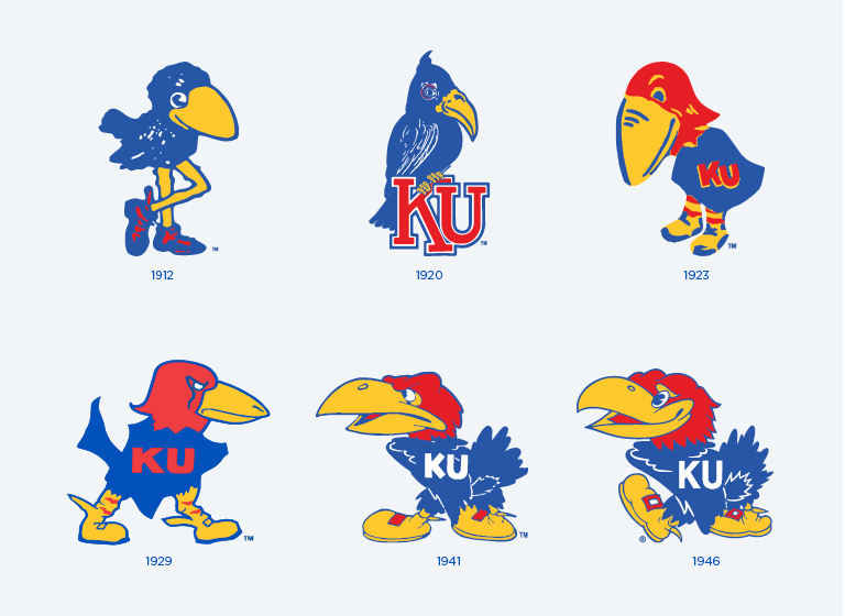
Historic Jayhawks
Historic Jayhawks carry specific associations about the university’s history and long-standing tradition of our mascot. For that reason, we nearly always use the historic Jayhawks together to convey continuity through change. We rarely use historic Jayhawks individually, and we strongly advise against using them to represent your group, program, or campus unit. If you wish to feature a Jayhawk for marketing or branding purposes, use the current Jayhawk.
The Jayhawks shown below are the only historic Jayhawks for the Lawrence and Kansas City Medical Center campuses. Anyone wishing to use these historic Jayhawks must request permission from the marketing communications offices on those campuses.
Permission for use must be granted by KU Marketing on the Lawrence campus.
While it is an official historic Jayhawk, JayDoc is not typically part of the lineup of historic Jayhawks. It is only used by the KU Medical Center.
Permission for use of JayDoc must be granted by the Office of Communications at the KU Medical Center.