Unit identity
The University of Kansas brand is intangible — an idea in the minds of the KU community — but the visual identity that reinforces and elevates that brand must be clearly defined, with rules that shape the use of colors, images, signatures, and typefaces.
The KU name holds the most important place within our brand standards. Our signature policy reflects this, strengthening the brand by judiciously limiting the use of signatures that pair university entities with the KU name.
This is both brand-focused and practical. Like many large universities and corporations, we must decide how far to extend our brand.
However, we recognize the significance that hundreds of offices and divisions place on an affiliation with the university’s name. In response, we have created guidelines that allow these units to create their own connections to the KU brand.
Establishing unit identity
KU units derive their identities from their affiliation with the larger university. Therefore, creation of unit logos is not permitted. Their use isolates units, weakens their audience’s association with KU, and creates a sense of incompatibility or competition between the unit and university.
Designers should seek creativity within cohesion, and units should turn to the visual identity’s expressive range for a look, feel, and tone they can own without disavowing KU’s valuable brand.
Unit signatures
The university signature is the preferred mark, but a few university entities are eligible for unit signatures, which formally link key university divisions to the KU primary signature.
When using a unit signature, use the KU primary signature with the university name in the central position. This signature emphasizes the university, demonstrates a clear and direct association between the unit and the university, and clarifies the brand for audiences who may not know that the Trajan letterform “KU” represents the University of Kansas. This is especially important for international audiences and regions outside of the Midwest.

Unit primary signatures should be used sparingly. They are mainly appropriate for on-campus audiences and communications with alumni and current students.

A small number of university entities are eligible for unit signatures, which formally link key divisions to the KU primary signature. The following units are eligible for unit signatures, created by KU Marketing:
- Lawrence campus
- Kansas City, Wichita, and Salina campuses
- Edwards Campus of Overland Park
- Chancellor’s office
- Provost’s office
- General counsel’s office
- Jayhawk Community Partners, the university’s corporate partnership and sponsorship development agency
- The College of Liberal Arts & Sciences and its two schools: School of the Arts and School of Public Affairs & Administration; School of Architecture & Design; School of Business; School of Education & Human Sciences; School of Engineering; School of Health Professions; William Allen White School of Journalism & Mass Communications; School of Law; School of Medicine; School of Music; School of Nursing; School of Pharmacy; School of Professional Studies; School of Social Welfare
- KU Libraries
- KU Lifelong & Professional Education
- Admissions office, graduate admissions office, international admissions office, Center for Orientation & Transition Programs, Financial Aid & Scholarships, Graduate & Postdoctoral Affairs, Jayhawk Global (KU’s online education center)
- Office of National Defense Initiatives
- Office of Community Impact
- Applied English Center
- KU Student Housing
- KU Public Safety
- Kansas Law Enforcement Training Center
- Kansas Fire & Rescue Training Institute
- Transportation Services
- Jayhawk Hospitality
- University of Kansas Conference Center
- Office of Sovereign Partnerships & Indigenous Initiatives
- Major research administrative units and these designated research centers: Office of Research, KU Center for Research Inc., KU Center for Technology Commercialization, Achievement & Assessment Institute, Biodiversity Institute and Natural History Museum, Center for Environmentally Beneficial Catalysis, Center for Remote Sensing of Ice Sheets, Hall Center for the Humanities, Higuchi Biosciences Center, Institute for Bioengineering Research, Institute for Information Sciences, Institute for Policy & Social Research, Kansas Biological Survey & Center for Ecological Research, Kansas Geological Survey, and Life Span Institute.
- KU Endowment, KU Alumni, Kansas Athletics, the Memorial Unions
- Dole Institute of Politics, Spencer Museum of Art, Hall Center for the Humanities, Lied Center, Biodiversity Institute & Natural History Museum, Wilcox Classical Museum, Spencer Research Library
- KU Medical Center’s 21 designated research centers and institutes. These are the Alzheimer’s Disease Research Center; University of Kansas Cancer Center; Center for Children’s Healthy Lifestyles and Nutrition; Digital Health/Co/Lab, Frontiers Clinical and Translational Science Institute; Hoglund Biomedical Imaging Center; Implementation Science for Equity COBRE; Institute for Advancing Medical Innovation; Institute for Neurological Discoveries; Institute for Reproductive and Developmental Sciences; Jared Grantham Kidney Institute; Juntos: Center for Advancing Latino Health; Kansas Center for Metabolism and Obesity Research COBRE; Kansas IDeA Network of Biomedical Research Excellence; Kansas Institute for Precision Medicine COBRE; Kansas Intellectual and Developmental Disabilities Research Center; Kansas PKD Research and Translation Core Center; KU Diabetes Institute; Landon Center of Aging; Liver Center; and Midwest Stem Cell Therapy Center.
UPDATED Nov. 18, 2025
Clear space
Clear space is the specified area surrounding official KU marks. No words, graphic elements, or other marks should be used in this space. Clear-space requirements must be observed in all circumstances.
The clear space is relative to the size of the signature and should be one-half the height of the KU logo (x) on all sides.
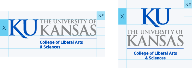
Minimum size
The height of x should not be less than three-eighths inch in print or 55 pixels in interactive uses.

Two color
The two-color signature is always preferred. It should be used on a white or light background. Don’t use the signature on a background that provides insufficient contrast.

One color
If used in one color, the signature should be printed in only black, KU blue (PMS 293), or KU gray (PMS 430).

White
When using a solid-color background, the signature colors should be reversed (white).
HOW TO USE Unit signatures

Don’t stretch, distort, spin, or change the color of any element.

Maintain adequate contrast.

Don’t remove or otherwise alter elements of the marks.

Don’t rearrange elements.
Unit name artwork
Although most KU units are not eligible for their own unit signatures, all KU units are able to identify themselves alongside KU marks: the KU logo, Jayhawk, university signature, or, if relevant, the unit signature of the parent unit. When this kind of construction is necessary — for signs, marketing collateral, and the like — communicators can create limited-use lockups of the unit name styled with a KU mark.
The arrangement of a KU mark with a unit’s name should be determined by the context. For example, the imprint space on a ballpoint pen likely benefits from a horizontal arrangement of KU mark and unit name. A small brochure might look best with a vertically stacked arrangement. Swag items, such as shirts, mugs, or tote bags, are often best served with more original artwork. Use KU typefaces and colors that provide the best tone for the context, and be sure to observe the clear space requirements of the KU mark in use.

Possible artwork solutions for KU units to identify themselves alongside KU marks.


Swag items, such as shirts, mugs, or tote bags, are often best served with more original artwork.

Context is key when determining your design solution.
Additionally, no one configuration of a unit name + KU mark should be used repeatedly or in all circumstances. This “rubber stamp” approach would create an ersatz logo, which is prohibited by the visual identity guidelines.
Units that need assistance creating name artwork can request a simple lockup from KU Marketing via this form. We will provide a variety of files with the unit name and KU logo and KU signature in the most-requested colors and formats. Note that the team typically needs at least 10 working days’ notice to create these files.


Unit name artworks set in white should be used with backgrounds that create a clear contrast.

Unit name Jayhawk artwork
KU Marketing also can create a one-time-use art file with a unit name and Jayhawk. Units can request a file here. Note that the team typically needs at least 10 working days’ notice to create this file.
