Hue are U: The search for the perfect Kansas colors
Crimson and blue run through our veins. But as intrinsic to the Jayhawk identity as they feel, those colors represent a choice made after a fair bit of disagreement and controversy — a saga well documented in an article on the wonderful KU History website.
The short version: KU’s original colors, sky blue and corn yellow, were deemed unfit by the university’s athletics board, which introduced crimson — somewhat unilaterally — in 1891. Blue returned five years later, establishing the iconic pair we wear and wave to this day.
And yellow? Yellow hung around thanks to sunflowers, flowing wheat, and a certain bird’s beak.
When we developed Our Chant Rises, our creative team prioritized palettes into warm and cool colors. Since crimson, blue, and yellow don’t come in just one shade, their exact calibration would be key to our brand’s consistency, flexibility, and attractiveness. (As primary colors with strong chroma values, they can go gaudy in a heartbeat.)
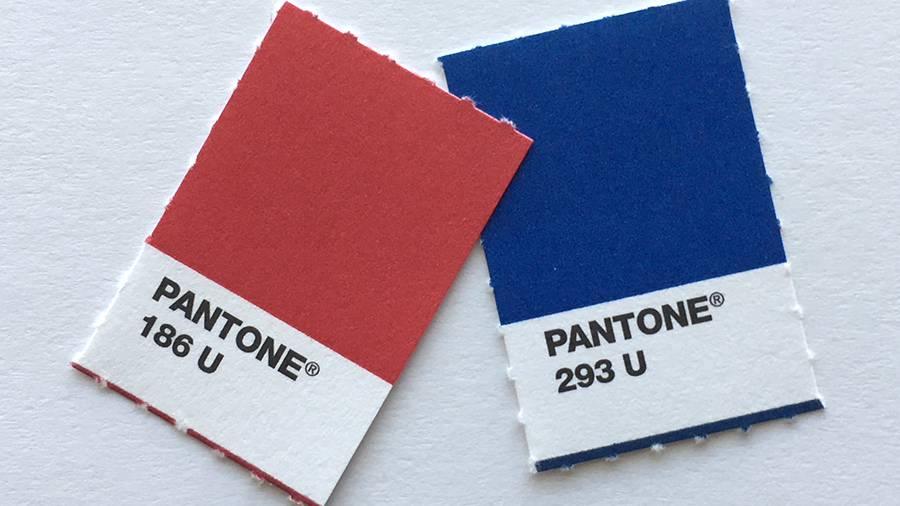
The primary palette remained untouched from the identity work done in 2006. We drew Crimson, KU Blue, and Jayhawk Yellow from our feathered mascot, as drawn by Harold D. Sandy in 1946. A neutral color, Signature Grey, was added to create a quartet of core brand colors.
The fun came with our secondary palettes, which are distinctly KU down to color names like Steam, Wheat, Limestone, and Fog (yes, it’s “misspelled”). This range of light, dark, bright, muted, and neutral tones gives designers options within crimson and blue bounds.
The secondary palettes were also made to support the relationship between crimson and blue. We already had an expansive set of cool blue compliments, but a short bench of warmer colors. With expanded variants, designers can feel emboldened to use crimson and blue, not just crimson or blue. (You might have noticed more materials from our office that feature both.)
Colors continue to be contentious on campus and important to our work — the palette page on our brand website is one of our most frequently visited. That’s why we worked hard to honor our crimson and blue heritage with hues that nod to KU’s history and iconography.