Becoming a PowerPoint power user: 8 tips when building your “deck”
When creating a presentation, you have a great head start thanks to the awesome PowerPoint templates available on our brand site. PowerPoint is installed on nearly every campus computer, it’s free for KU community members, and it was even co-developed by a Jayhawk, Thomas Rudkin.
Perhaps you’ve struggled with PowerPoint in the past. I sympathize. It’s not as flexible as I’d like, and a lot of features feel extraneous. Still, great results can be achieved using this ubiquitous piece of software.
Below are a handful of tips you can use to add zest and professionalism to your next presentation — no WordArt and origami slide transitions needed.
1. Strike a pose (and size)
Big screens show off every imperfection, and elements shifting from slide to slide can been unsightly. If you know the size and location of consistent elements like header and body copy text boxes, you can fix anything that feels off.
A quick flip through your “deck” (that’s a business-y term for a presentation) can reveal elements that have been accidentally scooted over or resized. Double-click the offending item and type the right size or position into the Size & Properties tab of the Format Picture pane. Way easier than eyeballing it.
2. Autofit to be tied
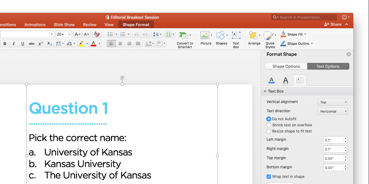
Set by default on new text boxes, autofitting shrinks content to fit the frame. This sounds helpful, but it mostly leads to bad habits and headaches. Autofit enables users to overstuff slides, and it wreaks havoc on designs with intentional font sizing.
Turning this off is simple. Double-click any text frame, and select “Do not Autofit” in the Text Box tab of the Text Options sidebar pane. Now point size won’t change as you add text.
3. Less text, more slides
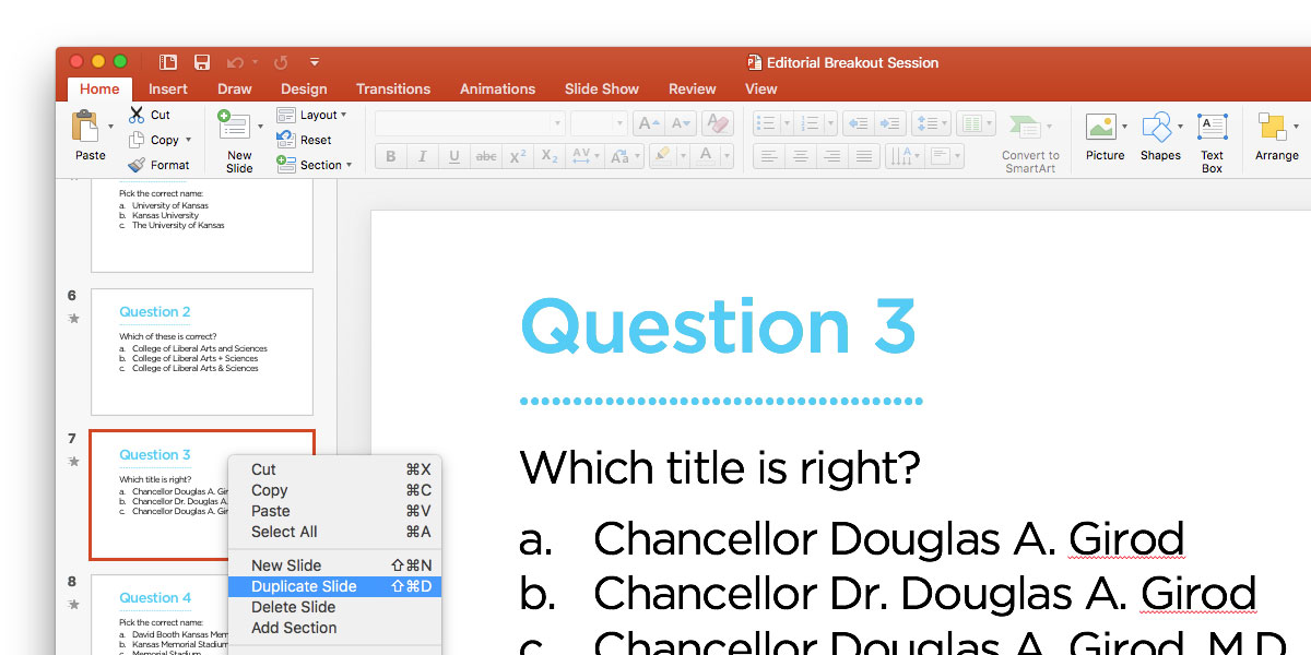
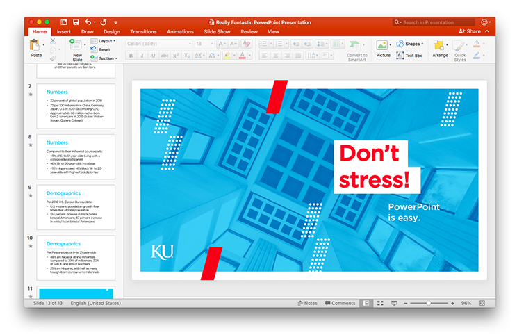
With autofit disabled, you’ll have to scrutinize your content. My rule? No squinting. That means that anything resembling Moby Dick or a VCR instruction manual needs adjustment.
Text distracts audiences, who will read instead of listen, so only keep important terms or phrases on your slides and leave the rest for your spoken remarks. If the text you want to keep doesn’t fit, break it across multiple slides. I duplicate the slide with too much text and then adjust both slides.
Trust me, the audience experience is better when slides are digestible. Plus, transitioning between them will keep you engaged.
4. Get animated
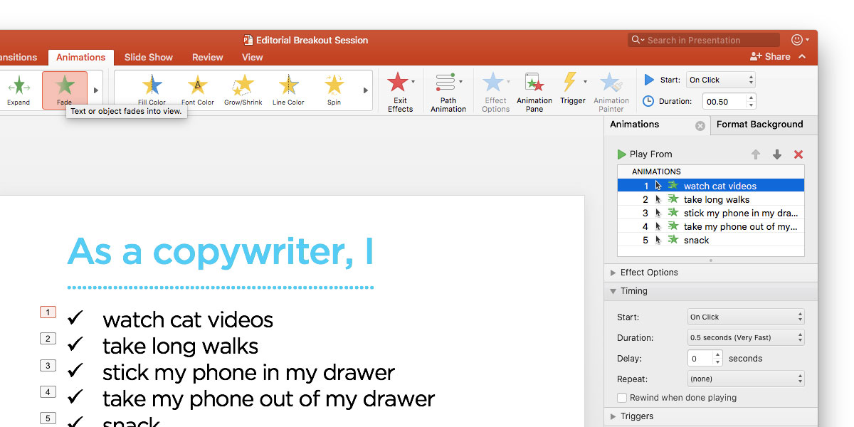
Even with reduced text and pared-down lists, you may have more on a slide than you want. Display an entire list, for example, and your audience will beat you to the end of it.
You can easily animate a list so that items appear one at a time. Highlight your list and choose an option from the Animation tab — “Appear” and “Fade” do the trick. Now click on the numbers next to your list items (they should all be “1”) and change the timing in the Animations pane to start “On Click.” Now each item won’t appear until you want them to.
Spend time trying different animations. I use them to pan longer images, “scroll” screenshots of websites, and draw attention to elements through opacity and color. But my strong advice: Keep it subtle. The line between “animated accent” and “abstract art” is thin.
5. Picture this
PowerPoint is not meant to be a robust graphics editor like Photoshop. It can, however, work in a pinch if your adjustments or ambitions are simple.
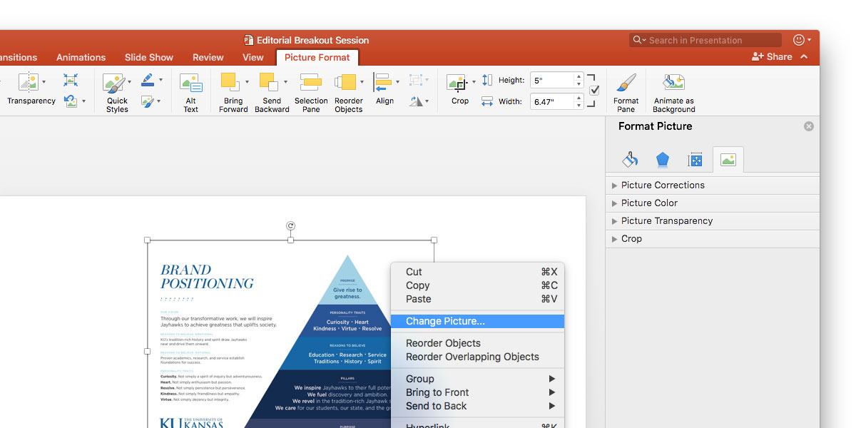
To get started, double-click on an image to open the Picture Format tab and Format Picture pane (not confusing at all). You’ll find a lot of options and buttons — plenty to ignore, but some to know well.
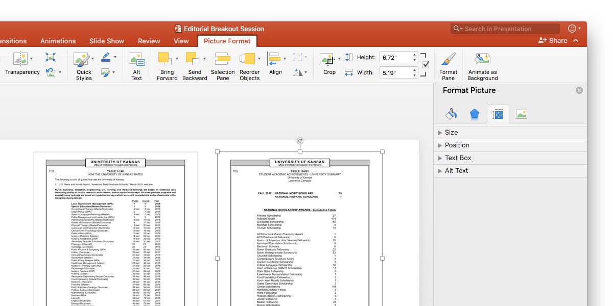
In the toolbar, you’ll find “Reorder Objects,” an isometric view that lets you layer objects, and “Align,” which lets you move objects to the corners and centers of a slide. A few minutes spent playing around with these tools will get you comfortable with them.
Turning to the Format Picture pane, you’ll find color and transparency options — perfect when you want to fade or overlay an image. You can also crop an image from here, though you might want to choose the more hands-on “Crop” function from the toolbar.
To easily swap out an image, right-click on it and select “Change Picture…” From the dialog box, select a new file. I use this to change backgrounds and reuse multi-image layouts.
6. Click a color
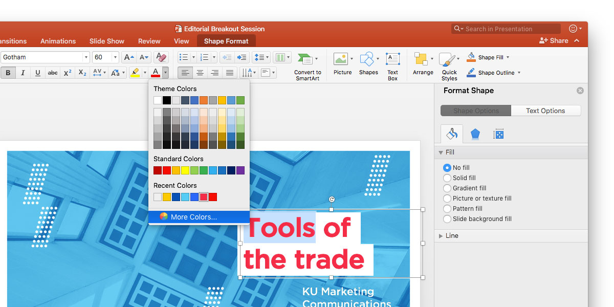
You’re a brand rock star, so naturally, you’ll be avoiding PowerPoint’s built-in color palettes. Get the right crimsons and blues with the eyedropper tool.
When perusing colors, you’ll see “More Colors…” at the end of the menu. Click on that, and at the bottom of this new window, you’ll see the eyedropper.
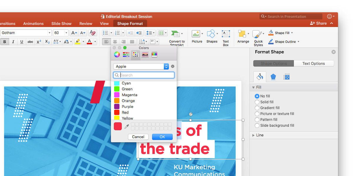
This little tool grabs color from anywhere, not just PowerPoint. I open the color palettes page on the KU brand site and grab the entire primary palette, as well as the “Night” and “Fog” colors from the secondary palette. Nifty.
7. Don’t forget fonts
All KU templates use Gotham; some also use Chronicle. If these fonts aren’t installed on a computer, PowerPoint will replace them with system fonts like Times and Arial, affecting the look and layout of a presentation.
If you’re presenting on a computer other than the one you used to create your presentation, make sure that the fonts are (legally) installed on it. Otherwise, you might want to export a PDF — though that’s not ideal if you’ve worked hard on your animations and transitions.
8. Don’t be scared!
You won’t break PowerPoint if you poke around. Try my recommendations. Crop an image. Animate some text. Heck, even whip up some WordArt if you want. You can always hit “Undo,” restore an old file, or open a new template and start from scratch.
Keep it simple, legible, and on brand. Don’t overstuff. Give your presentation and yourself room to breathe. Then get in front of your audience with confidence — because your preso will impress.