Get it on paper
So you came to a blog to read about paper.
Printed materials — while not the only means of communicating our message — are still an important component in our marketing plan.
One of the more exciting parts of the design process is the choice of paper. Today it’s not just about the weight or thickness. Sumptuous textures, bright colors, and specialty techniques can express a range of moods and thoughts.
All about paper
Here’s a brief glossary of terms we use when talking about paper:
- Coated or uncoated
- Coated papers are most effective with high-resolution offset printing and offer several grades of brightness.
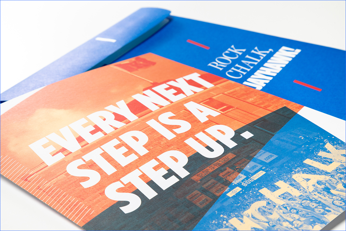
- Uncoated papers have warmth and tactile quality. With that in mind, our designers choose uncoated stock for most postcards and publications sent to potential students.
- Finish
- Finish refers to the appearance and texture of the paper’s surface.
- Weight
- Weight refers to the rigidity or thickness of the paper. Cover and text classifications each include several weight choices.
- Weight has a bearing on the cost. We were using a 100# cover stock for our mailed postcards, but we discovered 80# was as effective with considerable cost savings.
- Folding and mailing are important considerations in choosing paper weight. In a piece with multiple folds, the thickness of paper can add up quickly and cause problems in mailing. Similarly, a piece that is too flimsy might get damaged in the post office machinery.
Entering the fold
Designing for print, as with any project, usually starts with basic questions that come from the discovery phase:
- Who is our audience?
- What is our objective?
- What is the budget?
- What is the quantity?
- What is the tone or mood of the project?
- What tactics are we using?
- How will this be distributed?
- How and where will this be used?
- How long will this be around?
Answering these questions will narrow down the choices and indicate what papers might be best to use. Together, your budget and strategy will help to determine the best fit.
How should we print this?
Offset printing
- Offset printing requires pre-production setup and creation of metal printing plates, so it makes economic sense only for large quantities of printed pieces.
- Offset printing allows the use of Pantone inks, like KU Blue, PMS 293. Having that specific color, a “spot color” in printing terms, for the KU Blue allows our brand to be vibrant and consistent every time we print a project. Read an article about how to print using our colors.
- With offset printing, it’s especially important to discuss paper up front with the print vendor because it may take a few days or weeks to order the stock you want to use.
Digital printing
- Digital printing is becoming more common, and the quality of the printing is much better than it was a decade ago.
- Paper manufacturers are creating more paper lines specifically for use with digital presses and inks.
- Some digital printers offer the ability to use a spot color as an additional fifth color to the CMYK printing process, and it is usually acceptably close to the Pantone system.
Turn to the pros
Our local paper reps provide swatchbooks and expertise to help us determine what is right for a project and what’s available. We then work with our printing vendors to estimate what’s possible with the budget available.
- Base
- For most large offset printing projects, we turn to Lynx Opaque Ultra by Domtar. It’s uncoated, reproduces color dependably, is fairly economical, and has a good tactile feel and tooth.
- Another versatile paper is Accent Opaque by International Paper. It has several weights in text and cover, several finishes within those two grades, and a few brightness choices.
- Mid and Speciality
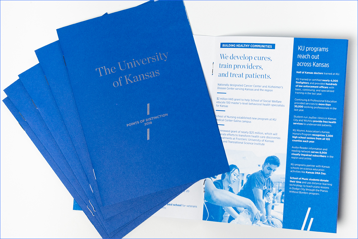
- For certain projects, we use paper color as a design element. In the Points of Distinction piece, we used Blast-off Blue from the Neenah Astrobrights line. The paper added an eye-catching color in a piece highlighting the university’s standings and accomplishments.
- Printing techniques
- Special printing techniques — like die cuts, foil stamping, and embossing— require careful consideration of paper. Ask your print vendor for recommendations to make these techniques shine.
All together
Printing with paper offers many fun possibilities to engage with your audience and get your message across in a memorable way. Let your budget and strategy guide you and your choices will be clearer, but don’t be afraid to ask for help.