Making the most of having the blues

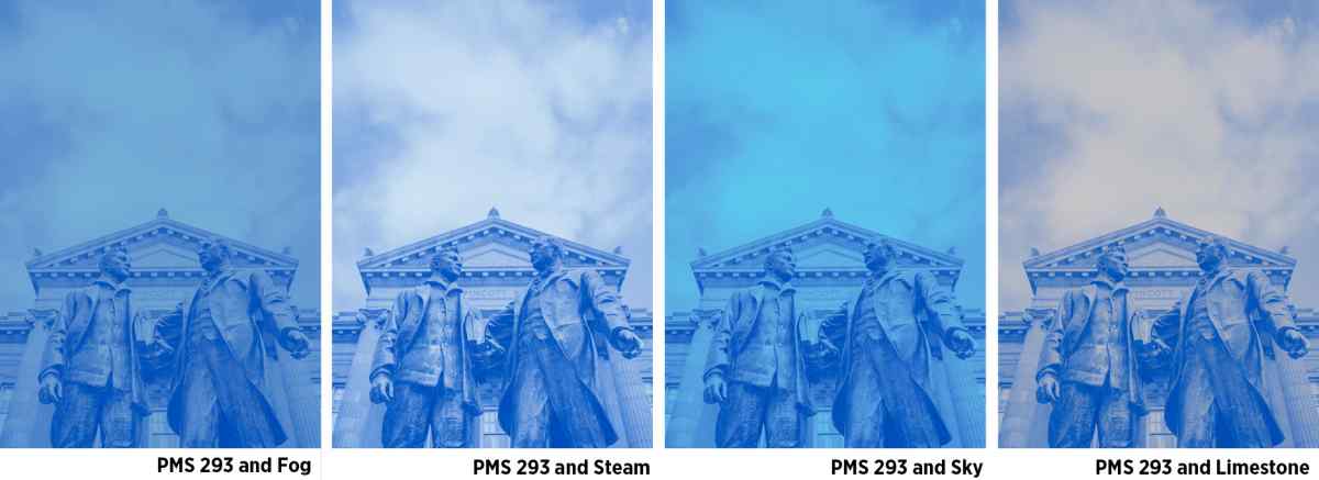
When used in print as a spot color, PMS 293 not only makes KU blue consistent across your publications, it also introduces an energy and vibrancy that instantly reads as KU. Create the same effect in your color-treated photos by using duotone presets to easily convert your photos to one of these four color combinations.
Here’s how:
Steps to create a duotone using presets
Download the duotone presets.
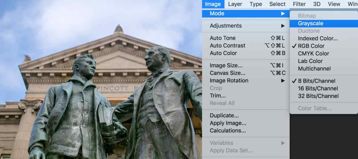
Start with a color image. Convert it to a grayscale image. (Image > Mode > Grayscale) Make sure your image has a full range of tonal values.
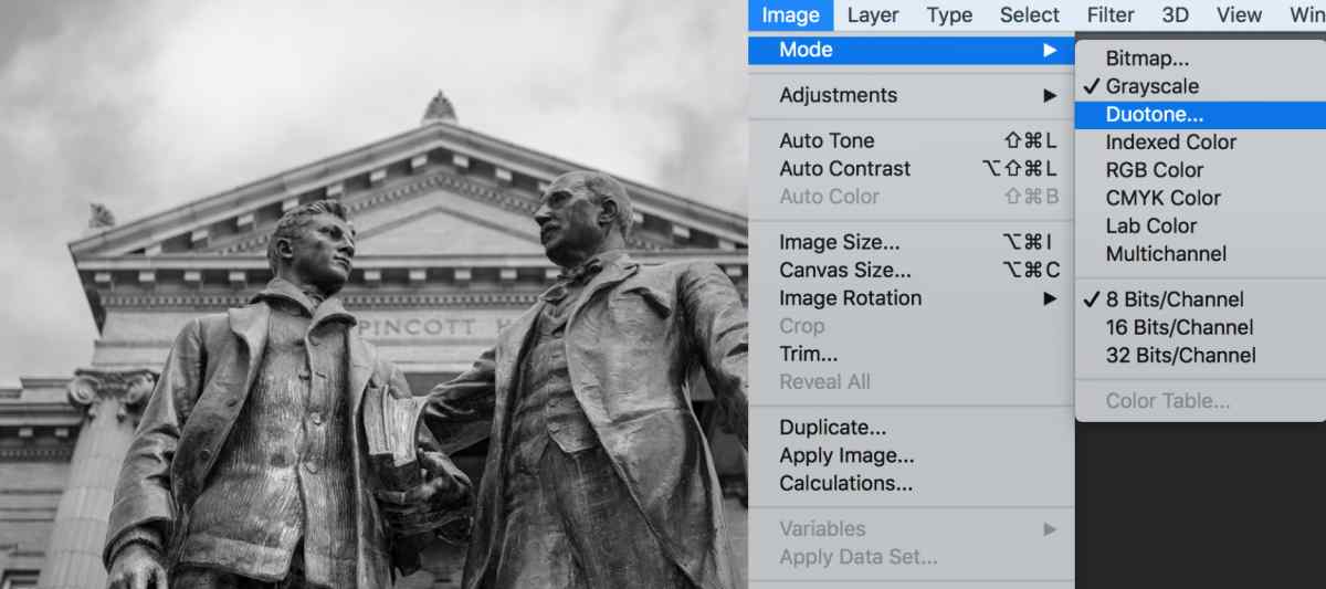
Choose Duotone in the same menu. (Image > Mode > Duotone)
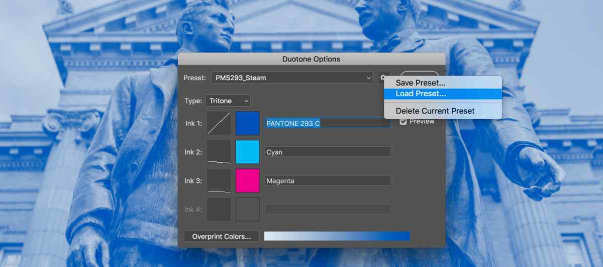
When the Duotone options dialog box pops up, select the gear to the right of the Preset dropdown. Choose Load Preset and navigate to the duotone presets stored on your computer. Choose the color variation. Tip: Not all photos look good with all color combinations. Use your judgment.
Make final adjustments to midtone contrast as needed and save the file as a .psd or .eps file. When you place your image into a professional design program (like InDesign or Illustrator) the spot color will be retained.
If your blues don’t look right in the on-screen preview, make a pdf. They should match. If not, make sure you are using PANTONE 293 C for all instances of KU blue.
For all other print uses
If you don’t need to use PMS 293 in your photo treatment, use the CMYK templates to create your color treated photo.
CMYK color palette for use with Adobe Creative Suite
For use on screens
Anytime you are creating something that will be seen on a screen it is important to use RGB or Hex colors rather than Pantone colors or CMYK colors. To create color-treated photos for screens, use the RGB templates.